01 The challenge
Organise five visually similar products into one coherent range while making the seed type, natural positioning and key nutritional messages easy to understand at a glance.
Multi-Variant Packaging Design
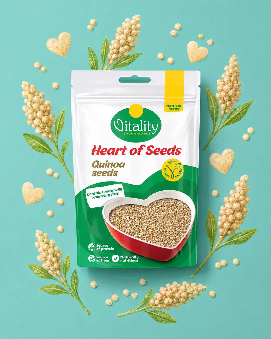
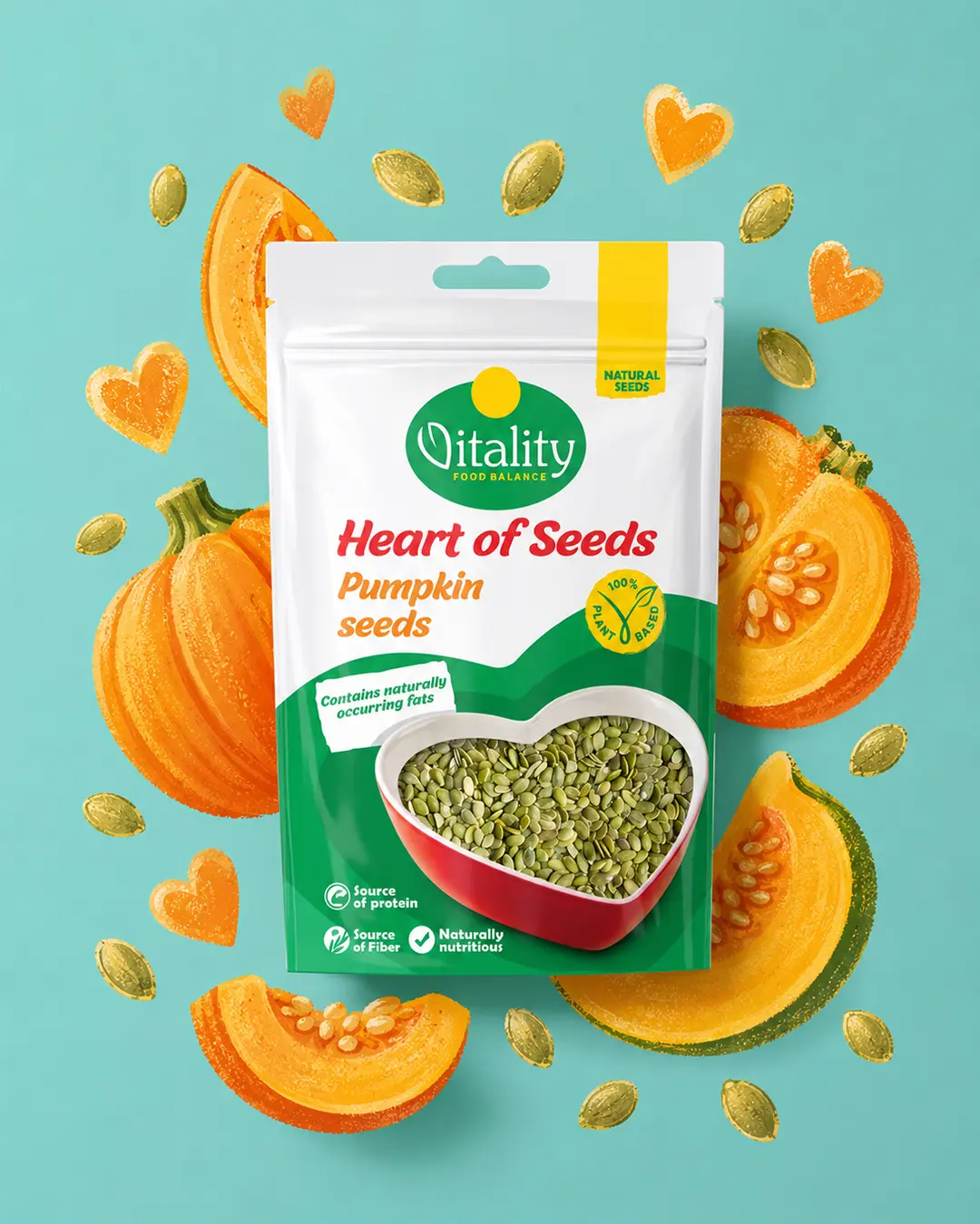
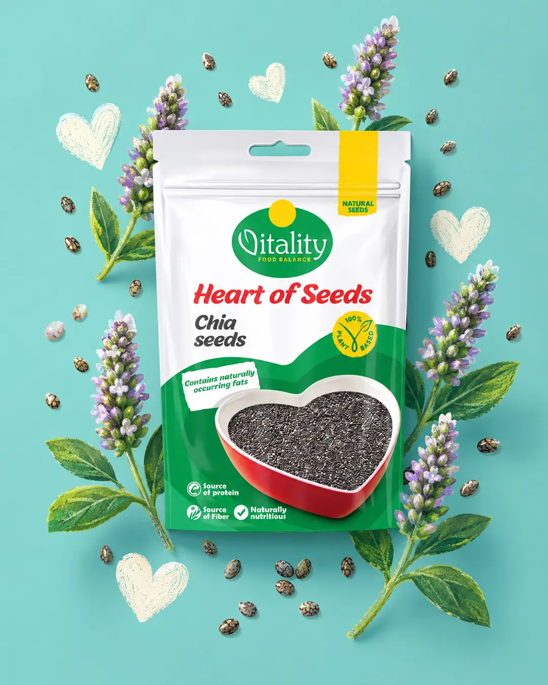
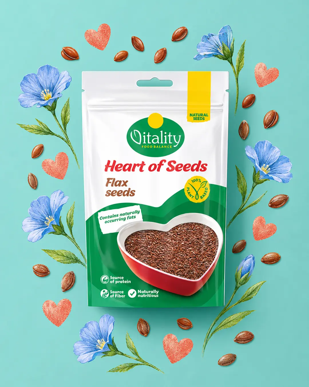
A five-product natural seed range that connects Vitality’s existing identity with a friendly, benefit-led concept. A heart-shaped window makes the real product part of the front design.
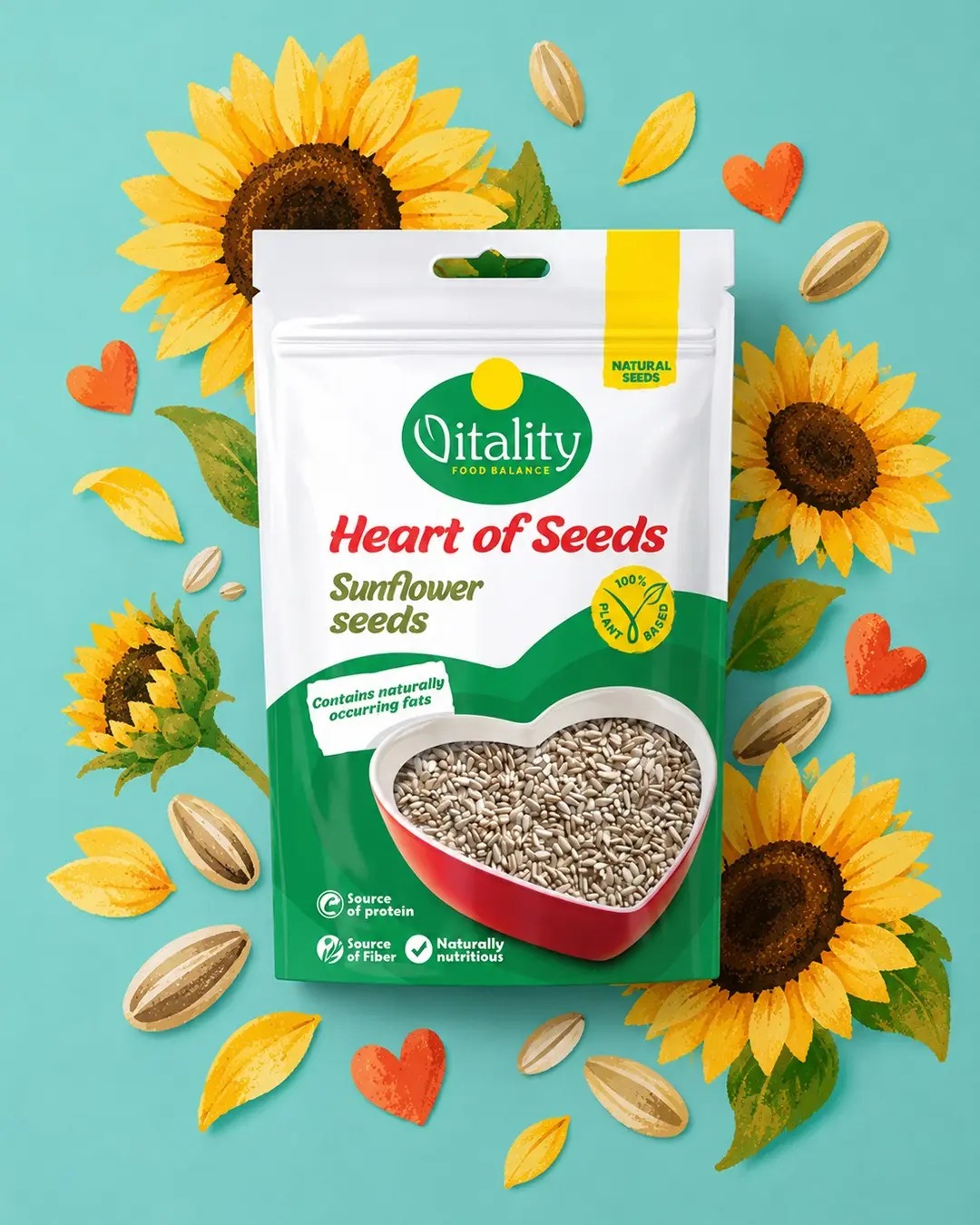
I designed the Heart of Seeds packaging range for Vitality across five variants: Sunflower, Quinoa, Pumpkin, Chia and Flax. The system preserves Vitality’s established green-and-white identity while introducing a warm, approachable concept built around a heart-shaped product window that creates a filled heart-shaped plate. Clear variant naming, ingredient-specific colours, benefit icons and visible seeds create a strong information hierarchy, easy range navigation and consistent shelf recognition.
Organise five visually similar products into one coherent range while making the seed type, natural positioning and key nutritional messages easy to understand at a glance.
I retained the green-and-white master brand, used the heart as the central range idea and combined product visibility, clear variant naming and consistent benefit icons.
Each variant is easy to navigate independently, while the repeated heart window and information structure create strong family recognition across the range.