01 The challenge
Balance the strength and weight expected from a premium tequila with a celebratory, social personality—without allowing the illustrative concept to become visually chaotic.
Brand Identity & Label Design
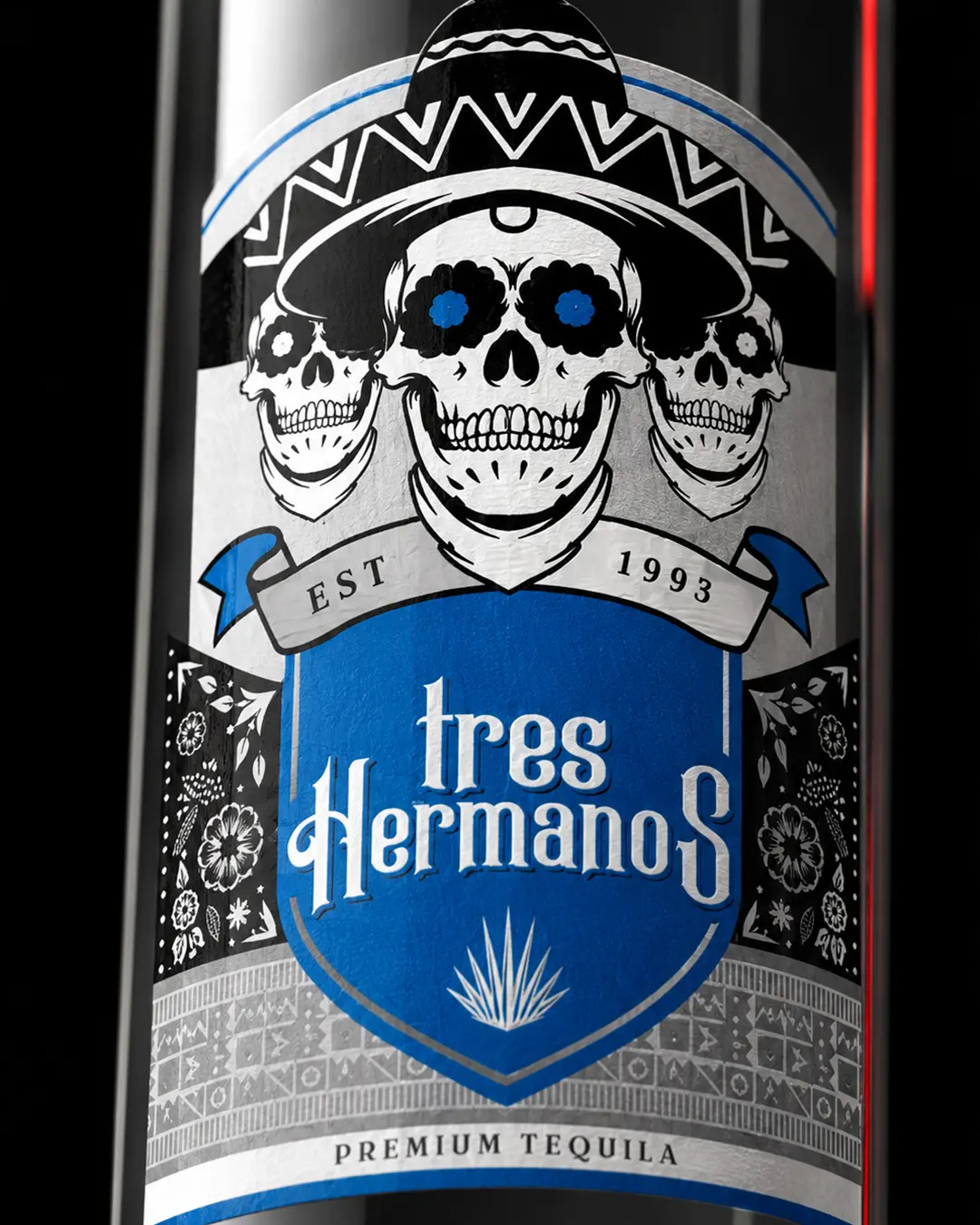
Tres Hermanos translates the idea of three close friends into a distinctive premium spirits identity. Three illustrated skulls form the central narrative and give the label an immediate, memorable signature.
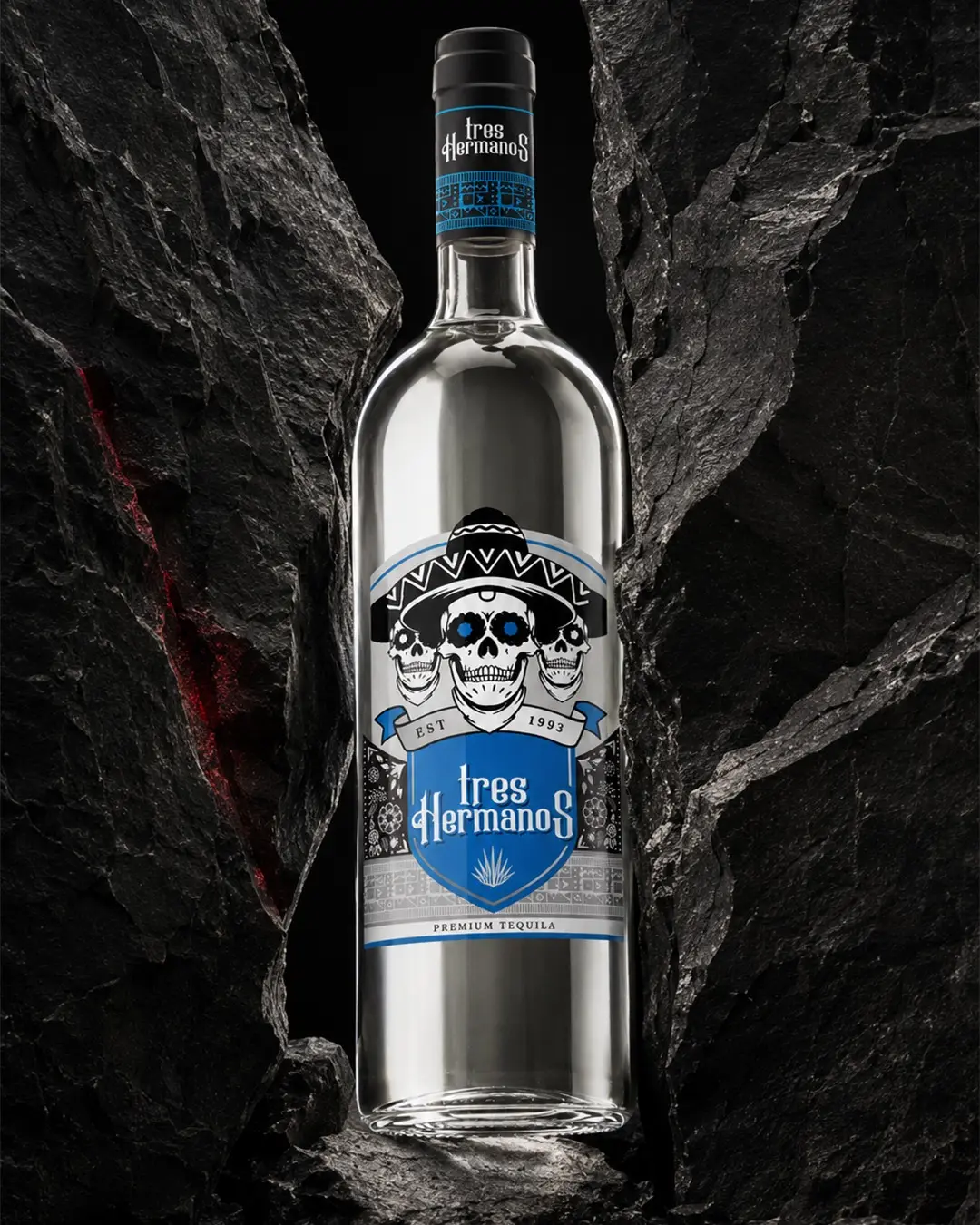
I created the brand identity and bottle label for Tres Hermanos, a premium tequila concept whose name represents three close friends united like brothers. Three illustrated skulls became the central symbol of their bond, supported by bold typography and Mexican-inspired ornamental details.
Balance the strength and weight expected from a premium tequila with a celebratory, social personality—without allowing the illustrative concept to become visually chaotic.
I built the identity around a three-skull emblem, then controlled the energy through a structured shield, expressive typography, a restricted colour system and Mexican-inspired ornamental bands.
The finished label combines bold character, premium detail and a clear story of friendship, creating a recognisable presence across the bottle and closure.