01 The challenge
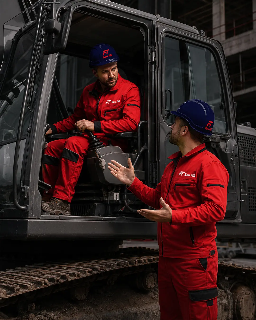
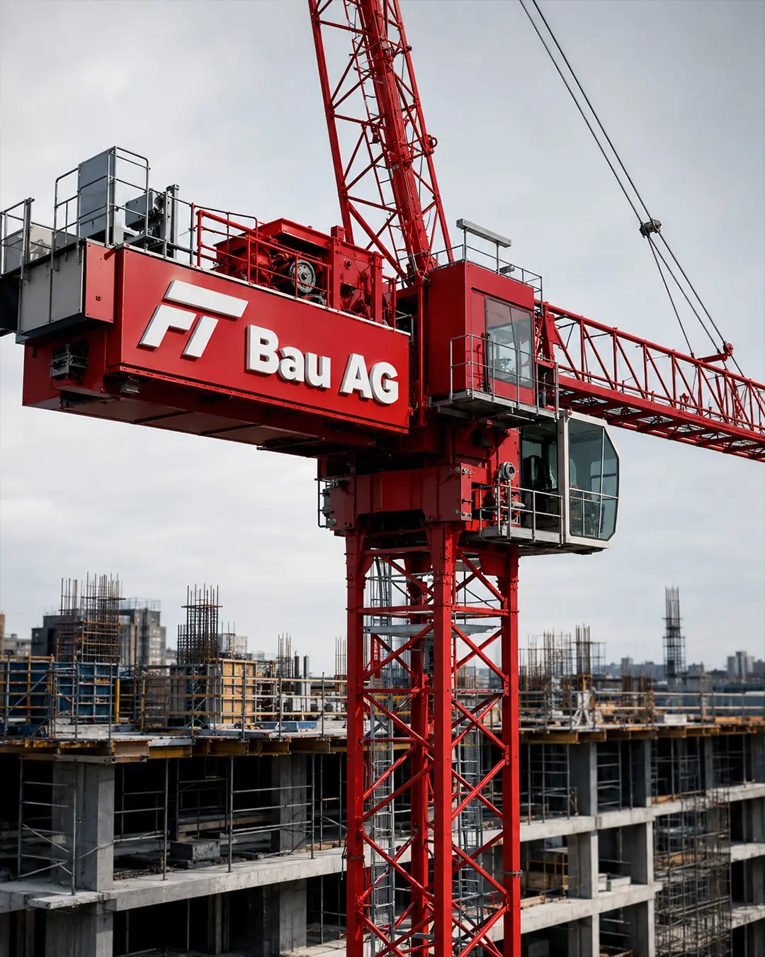
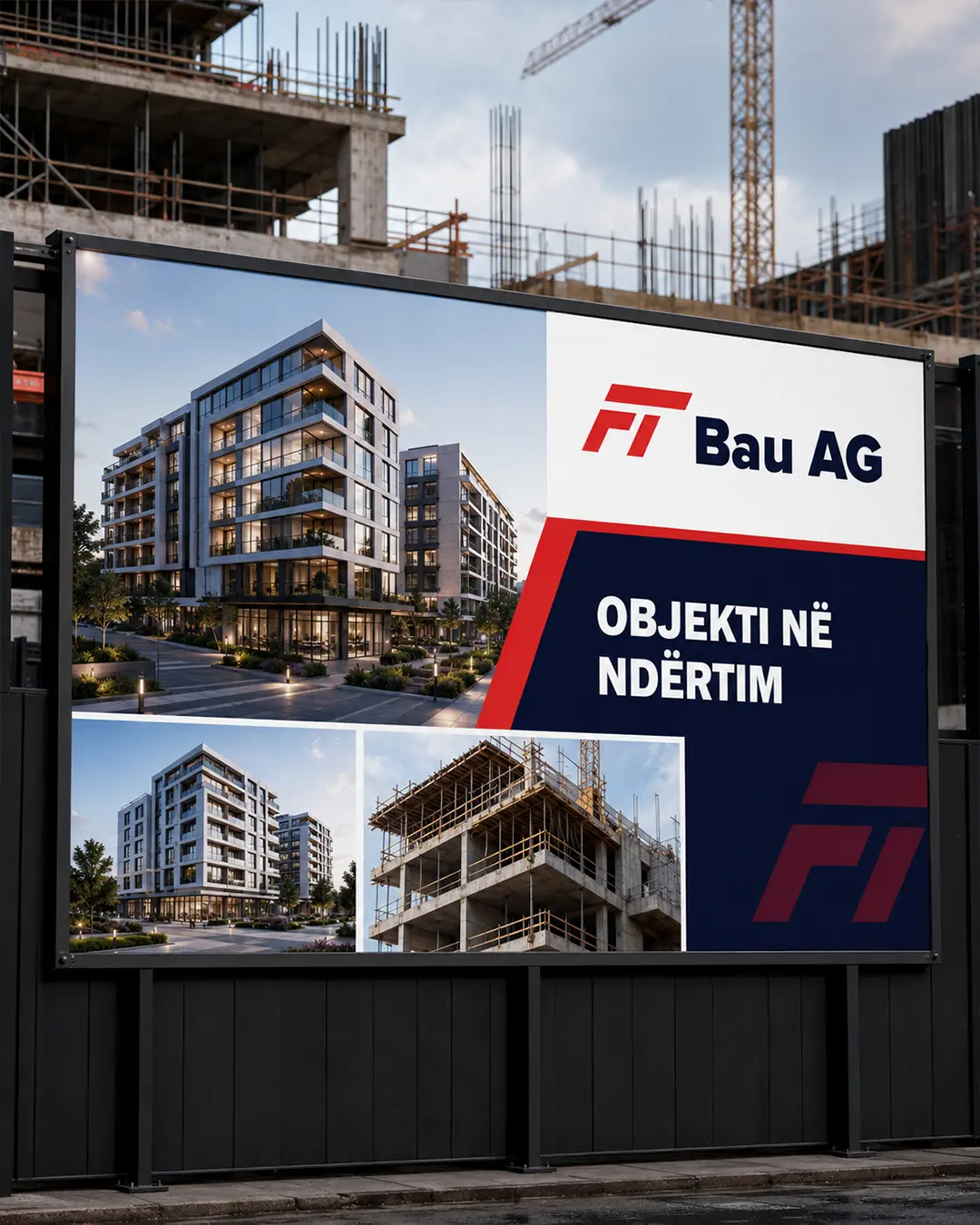
Create a symbol that communicates precision and strength, works in demanding physical environments and remains clear across uniforms, machinery and large-format applications.
Logo & Visual Identity Design
A direct, industrial identity for a Swiss construction company, centred on a compact FT monogram designed to remain recognisable from small safety applications to large construction-site signage.
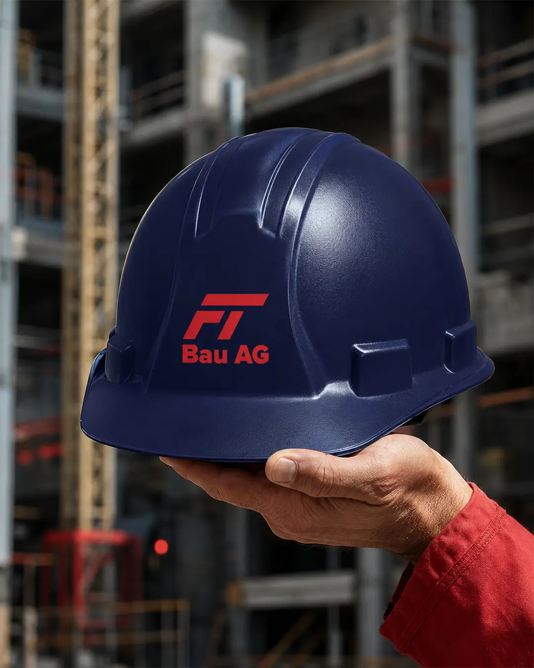
I designed the logo and visual identity for FT Bau AG, a Switzerland-based construction company. The custom monogram combines the letters F and T into one compact, architectural symbol, creating a clear and recognisable brand signature.
Create a symbol that communicates precision and strength, works in demanding physical environments and remains clear across uniforms, machinery and large-format applications.
I merged the initials F and T into a forward-moving geometric mark and paired it with a sturdy wordmark and a controlled red and deep-navy application system.
The resulting identity is compact, practical and scalable, giving FT Bau AG one consistent signature across every major construction touchpoint.