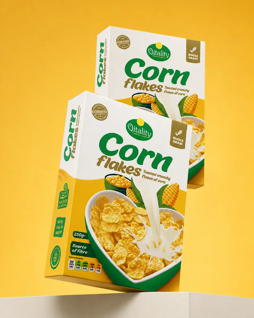
01 The challenge
Balance the Vitality brand’s natural positioning with the energy and appetite appeal expected from a mainstream breakfast product.
Food Packaging Design
A bright breakfast-cereal pack that combines natural brand cues, strong shelf visibility and clear nutritional communication.
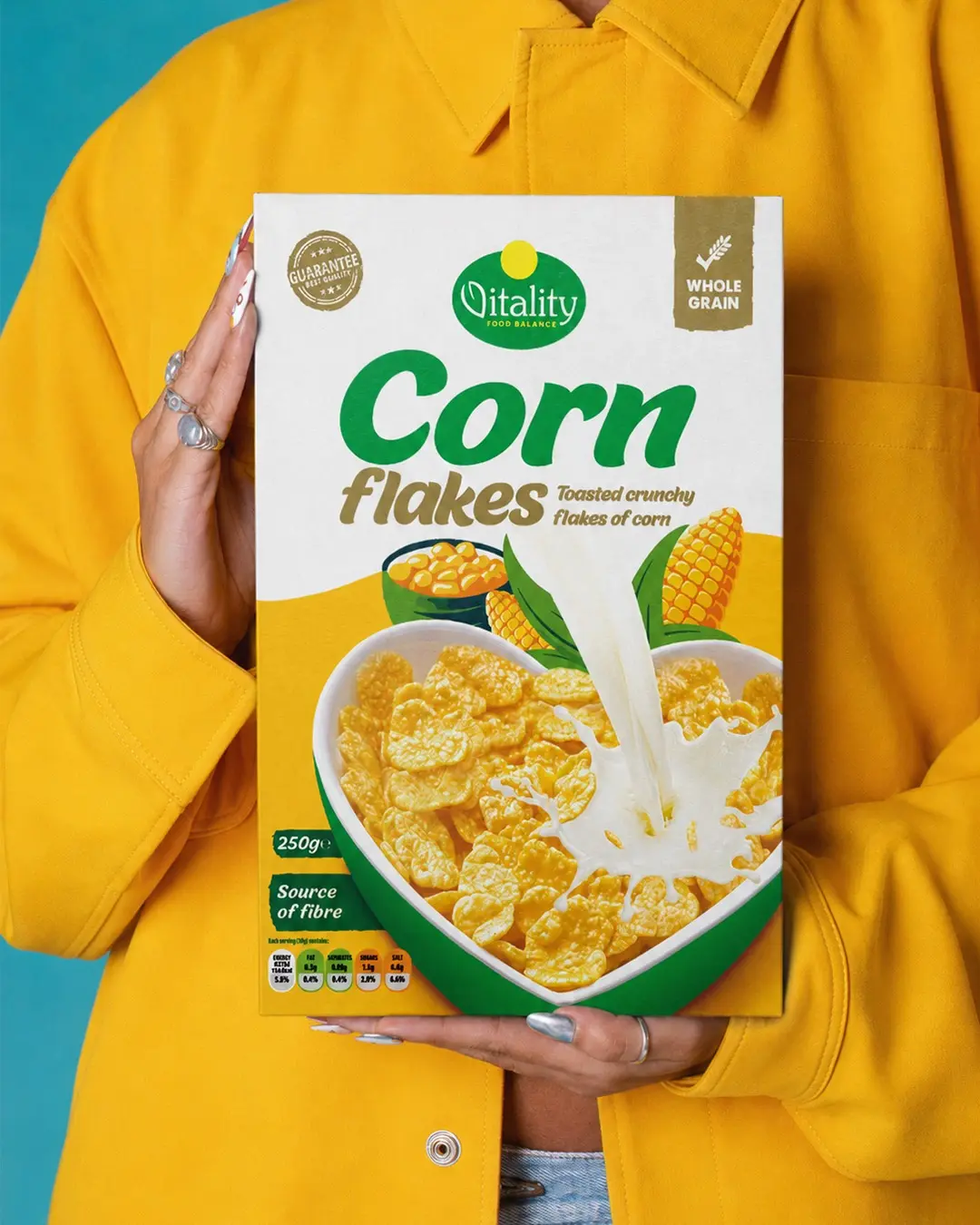
I designed the packaging for Vitality Corn Flakes, creating a fresh and energetic visual system aligned with the brand’s focus on balanced everyday nutrition. Green communicates natural quality and vitality, while the bright yellow field connects directly to corn and creates strong shelf visibility. Bold typography, clear whole-grain messaging and appetising cereal imagery establish an effective hierarchy, making the product and its key benefits immediately recognisable.
Balance the Vitality brand’s natural positioning with the energy and appetite appeal expected from a mainstream breakfast product.
I paired the established green identity with a yellow corn-led field, bold naming, benefit messaging and a large serving image.
The result is an energetic and approachable cereal pack with immediate category, ingredient and brand recognition.