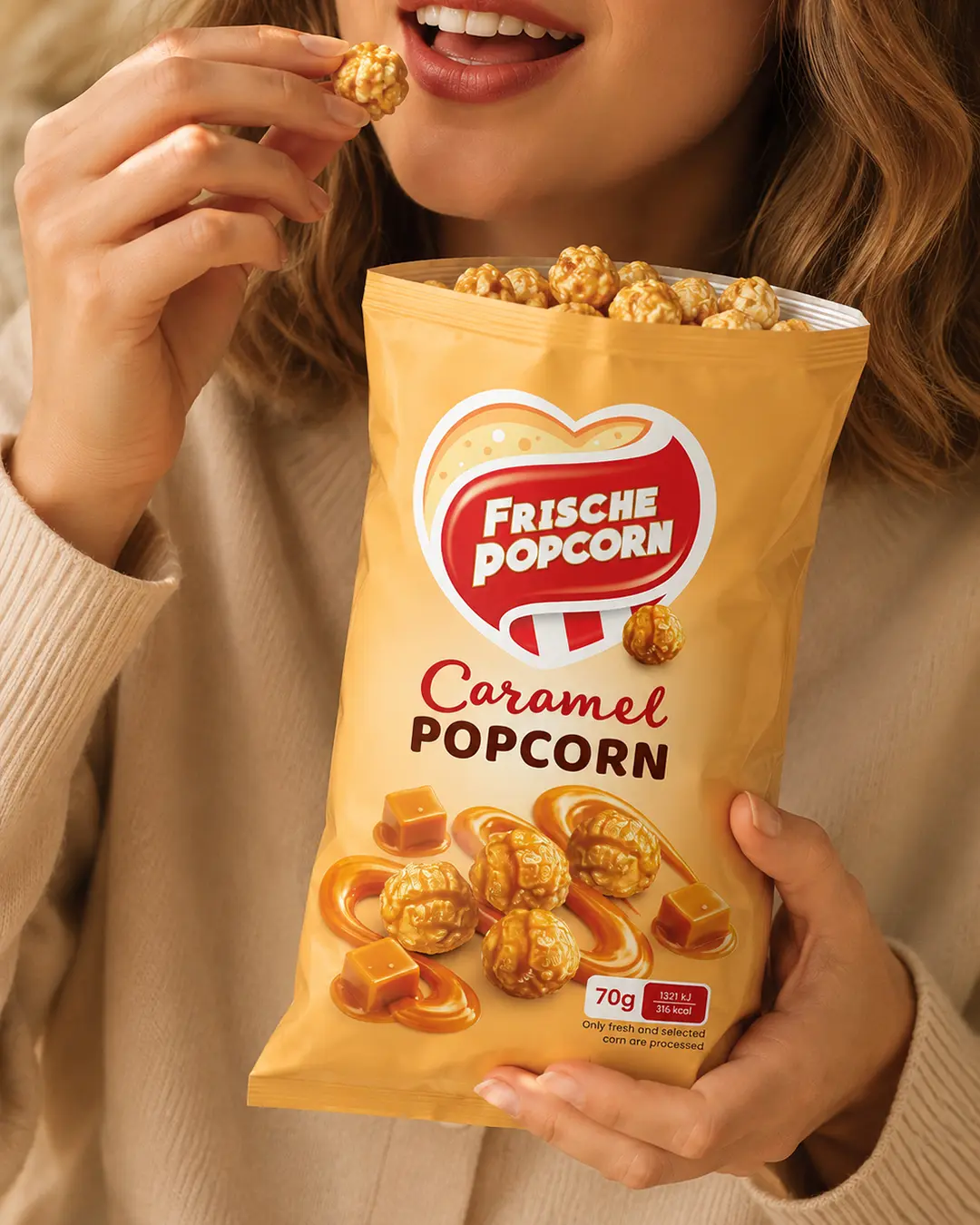
01 The challenge
Express the indulgent caramel flavour while keeping the established brand mark dominant and the small-format pack easy to read.
Caramel Popcorn Packaging Design
A warm, flavour-led packaging concept designed to make caramel richness and product quality instantly visible.
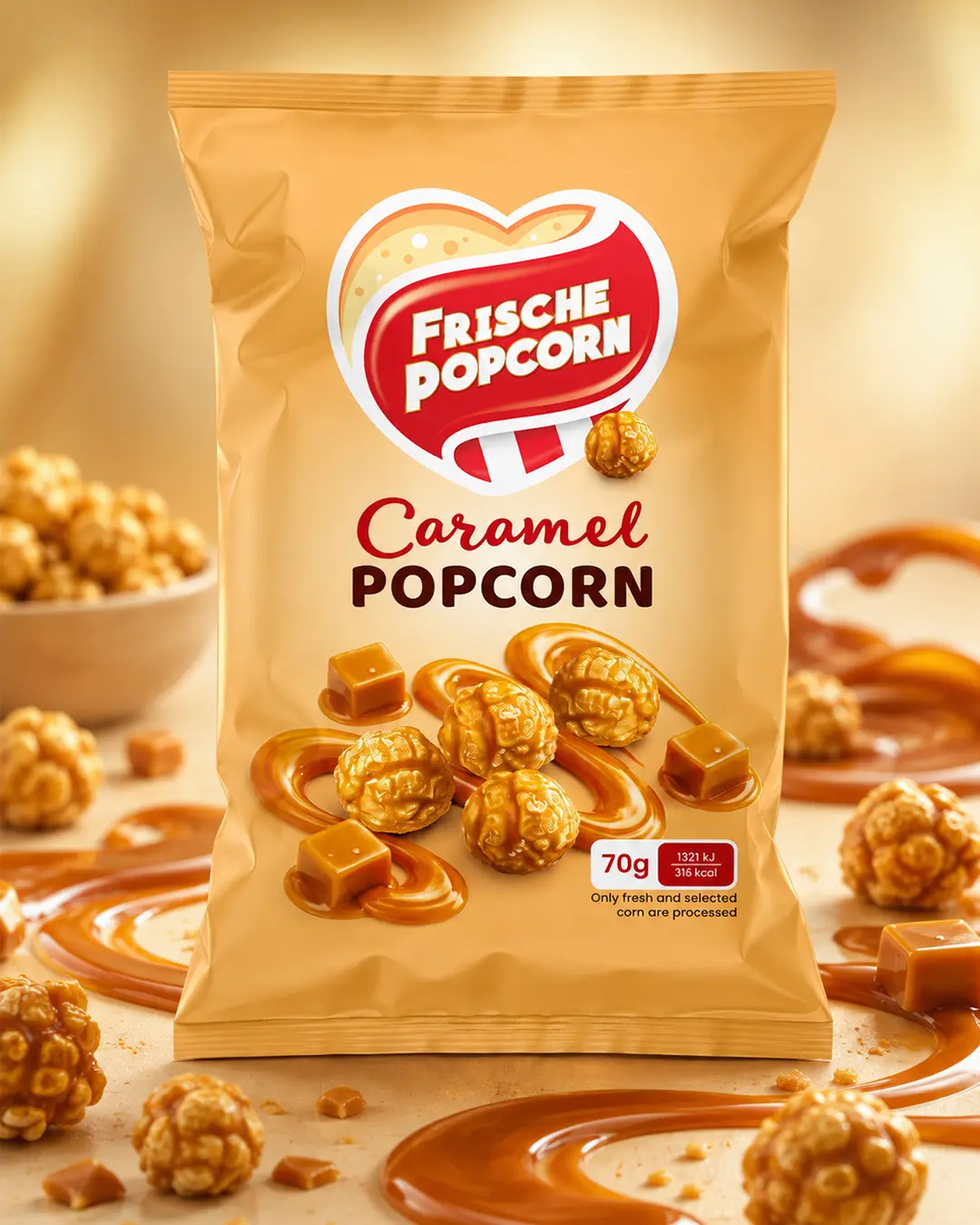
I created the packaging design for Frische Popcorn’s Caramel Popcorn, developing a warm and indulgent visual direction around its caramel-coated flavour. The bold red brand mark ensures immediate recognition, while golden tones, caramel swirls and detailed product imagery communicate taste and texture at first glance. A clear information hierarchy keeps the brand, flavour and key product details easy to identify, giving the 70 g pack a distinctive and appetising shelf presence.
Express the indulgent caramel flavour while keeping the established brand mark dominant and the small-format pack easy to read.
I built the composition around golden colour cues, caramel swirls, detailed popcorn imagery and a direct hierarchy from brand to flavour and weight.
The final pack presents a rich, appetising product story while maintaining clear recognition and practical retail communication.