01 The challenge
Build a recognisable master-brand presence while allowing shoppers to distinguish five flavours instantly in a visually crowded snack category.
Multi-Variant Potato Chips Packaging Design
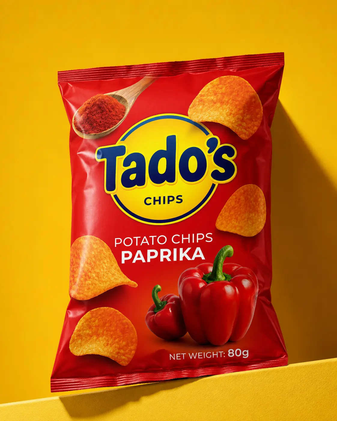
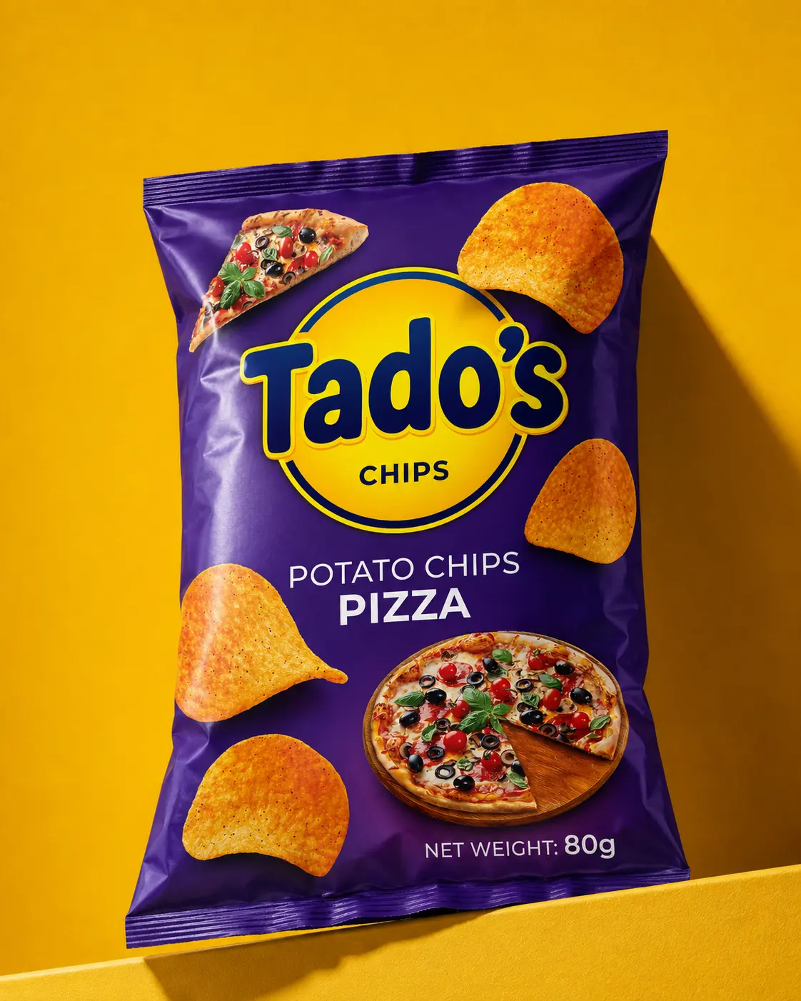
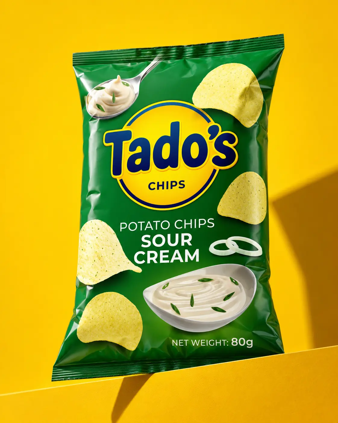
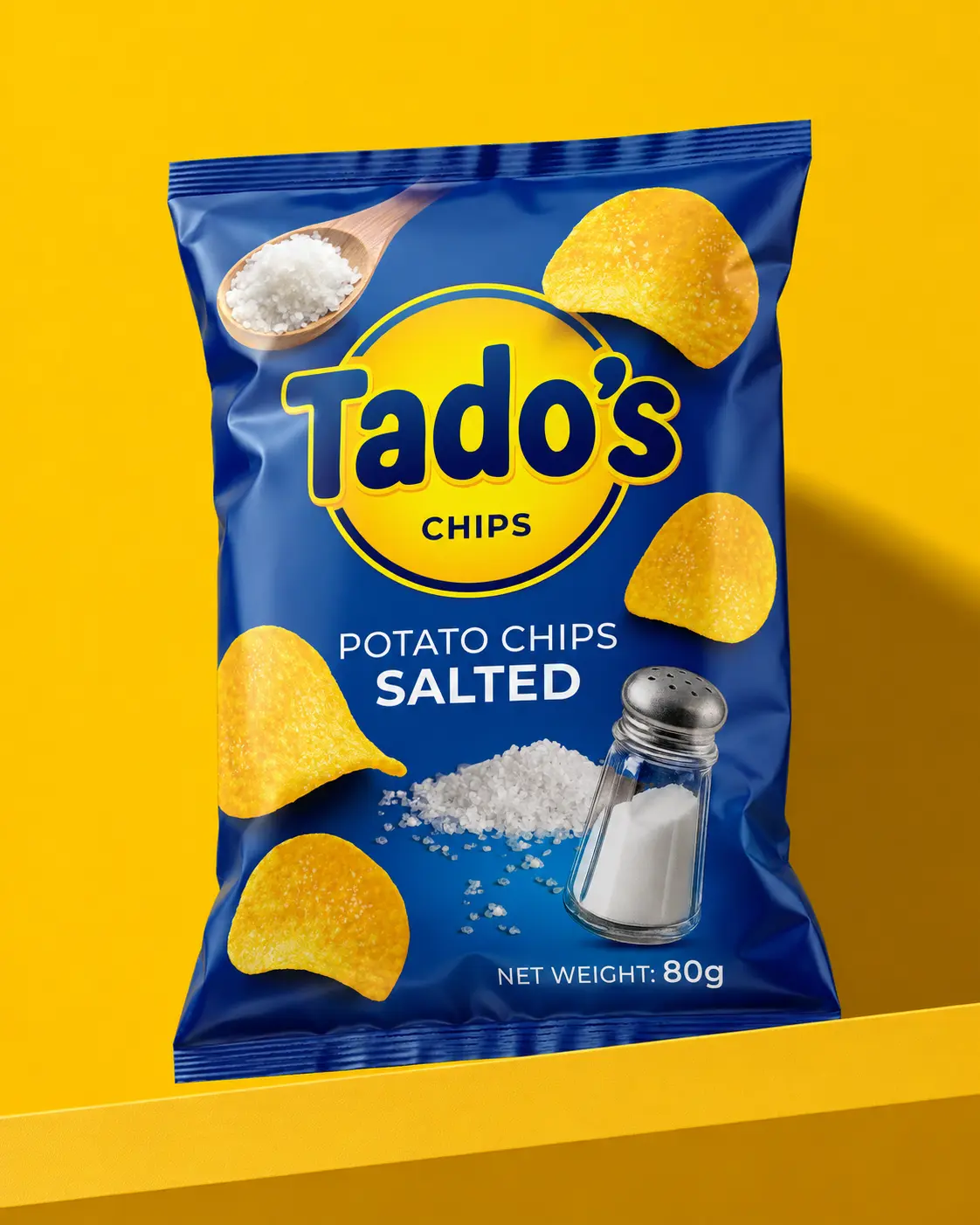
A bright, energetic packaging family for five 80 g potato-chip flavours, designed around a dominant circular brand mark and a simple, repeatable product hierarchy.
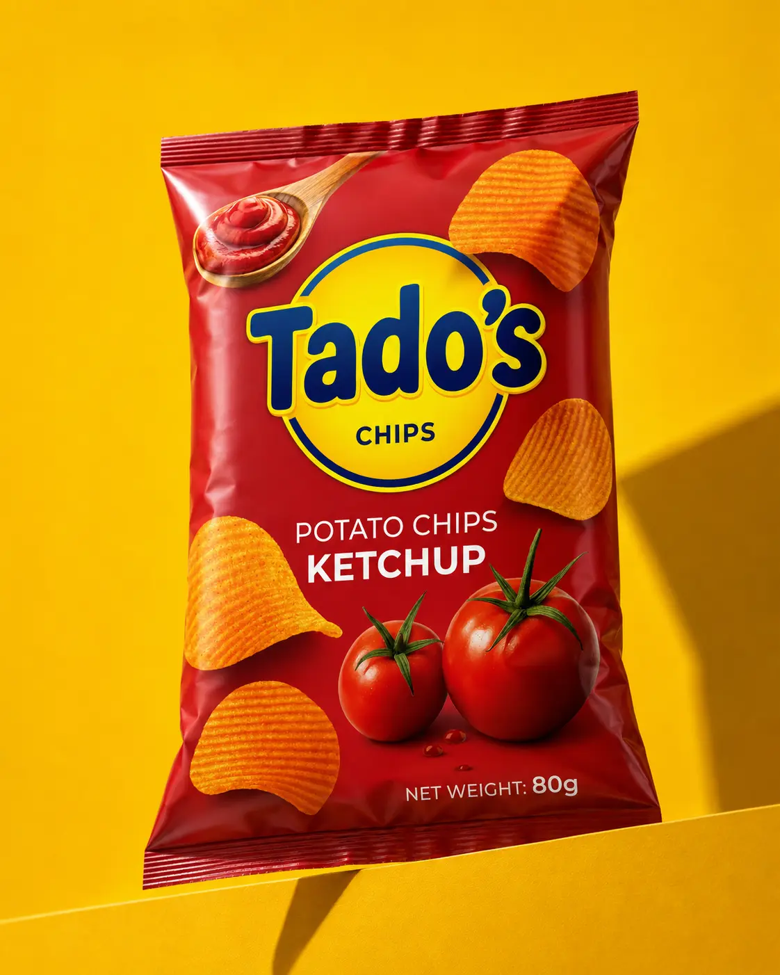
I designed a five-variant packaging system for Tado’s Chips, covering Ketchup, Paprika, Pizza, Sour Cream and Salted flavours. The oversized yellow-and-blue brand mark creates immediate recognition, while bold pack colours and flavour-specific ingredient imagery make each variant easy to identify. A consistent hierarchy across the 80 g range keeps the product family unified and gives it a bright, energetic and highly visible shelf presence.
Build a recognisable master-brand presence while allowing shoppers to distinguish five flavours instantly in a visually crowded snack category.
I made the brand mark the primary visual anchor, assigned a strong pack colour to each flavour and paired every variant with direct, appetising ingredient imagery.
A unified product family with consistent typography and structure, clear flavour navigation and strong visual impact across the complete range.