01 The challenge
Differentiate five fragrances quickly on shelf without fragmenting the master brand or allowing ingredient imagery to overpower the product name and key information.
Multi-Variant Packaging Design
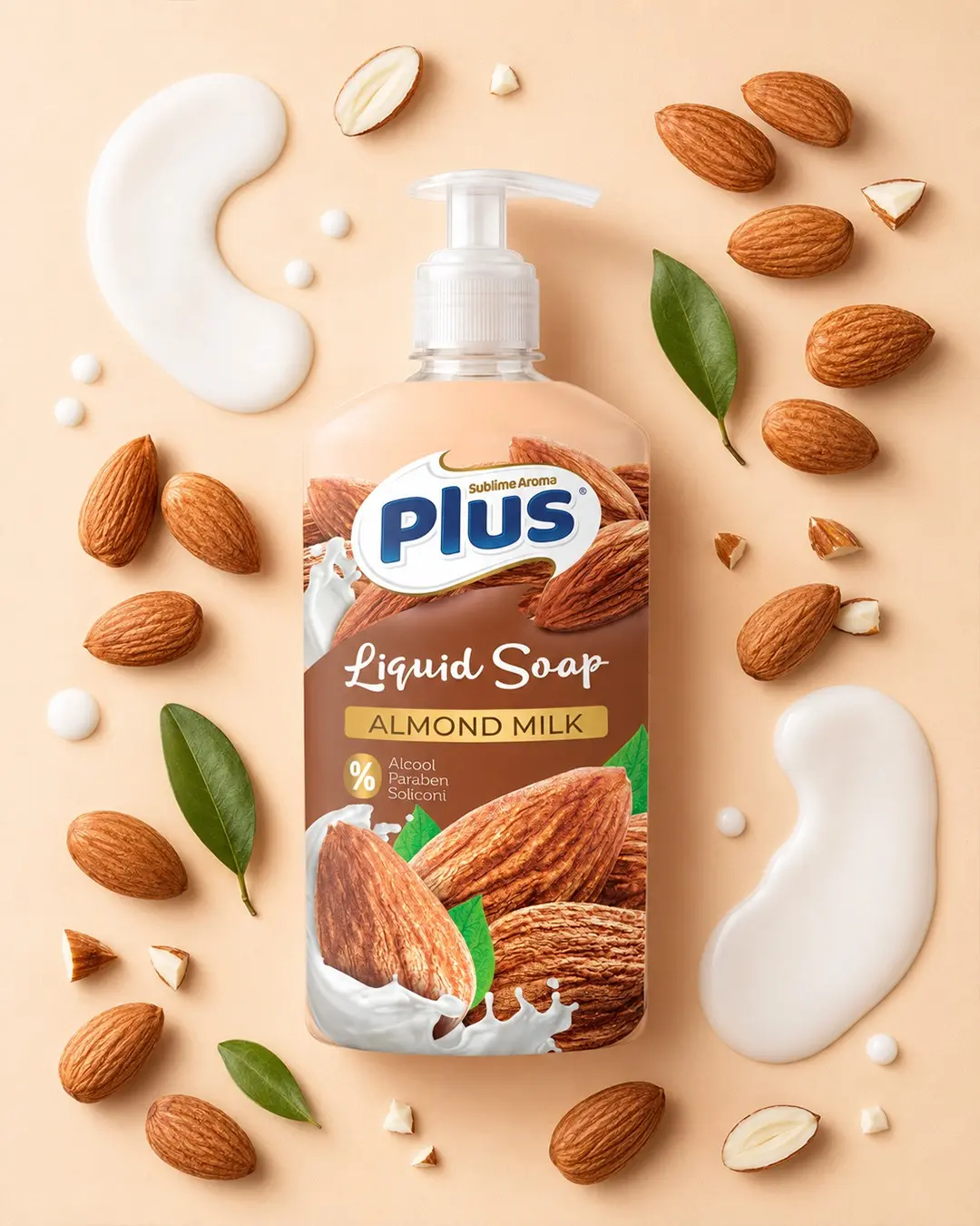
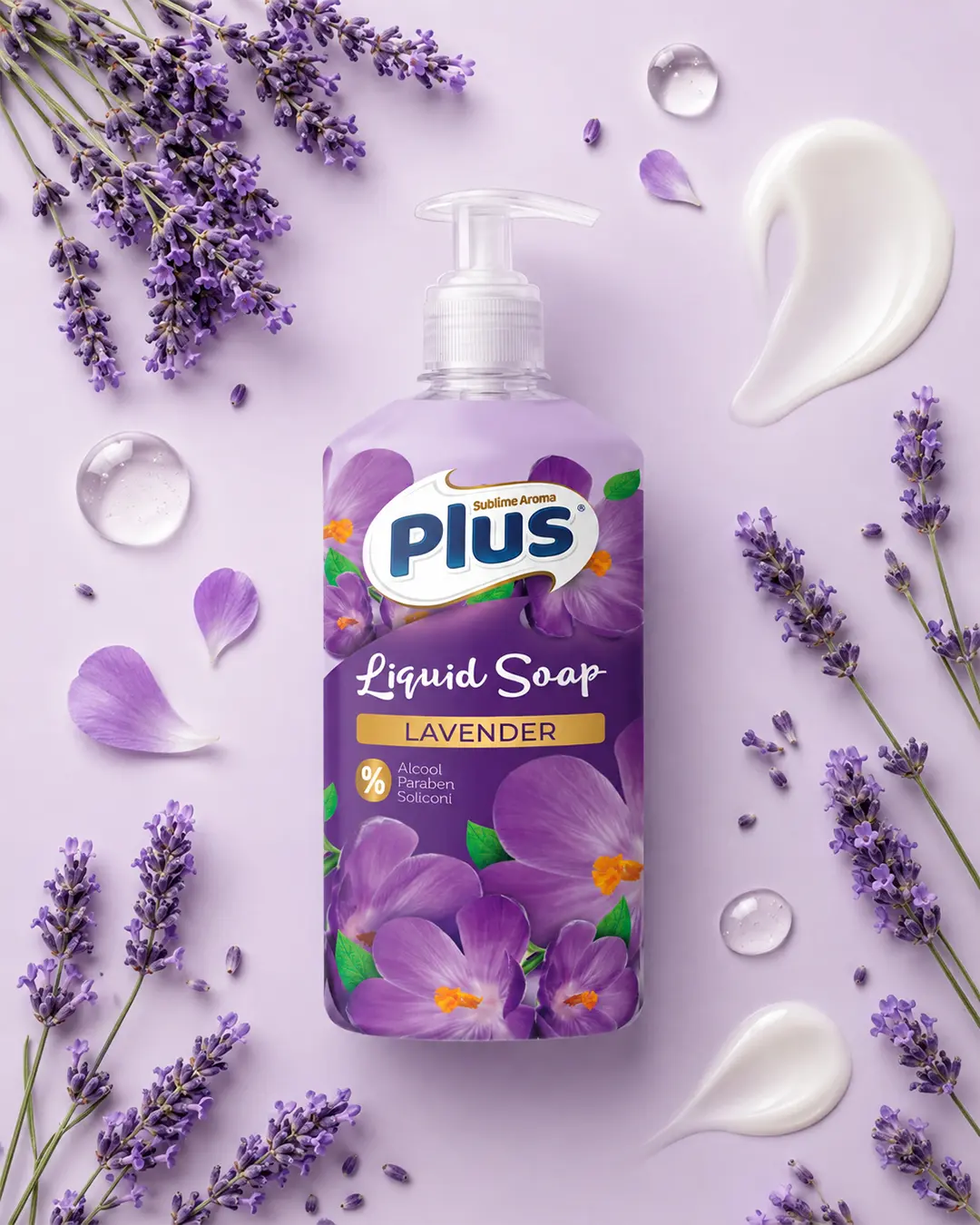
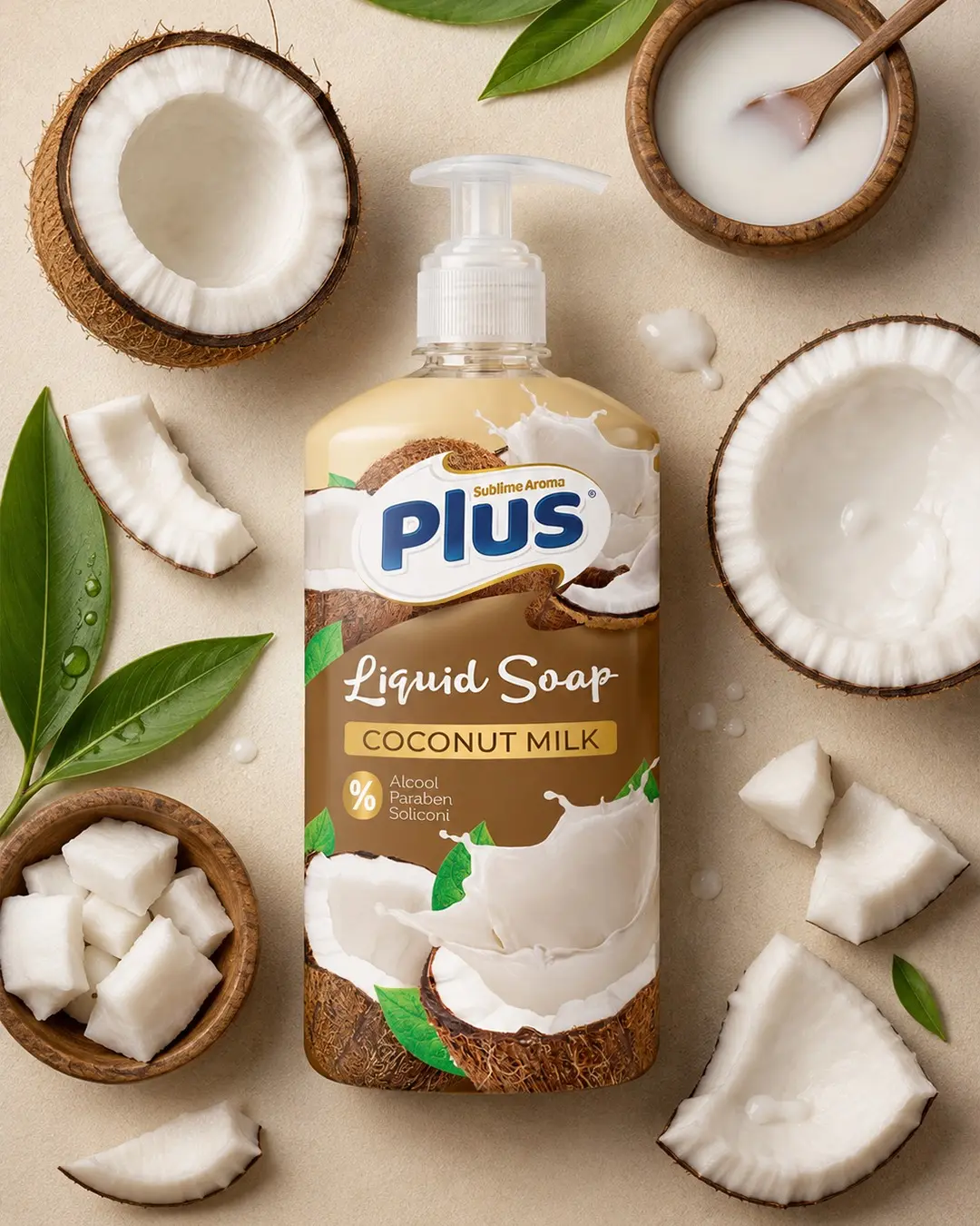
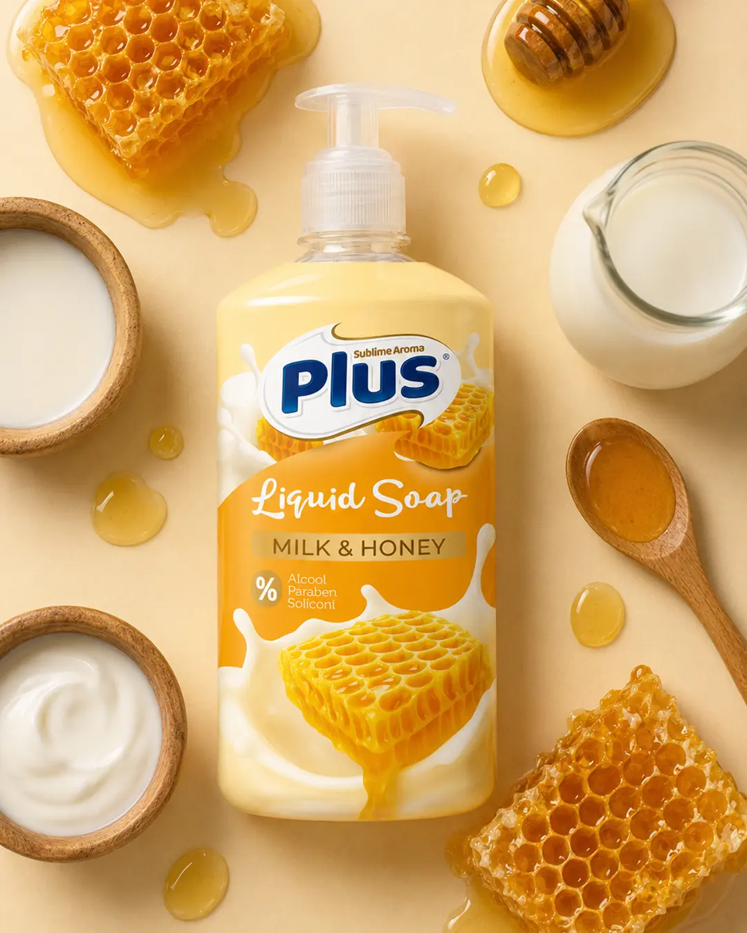
A cohesive five-variant packaging family covering Natural Olive, Almond Milk, Lavender, Coconut Milk, and Milk & Honey. The system was designed to feel modern and approachable while preserving the visual recognition already established by Plus.
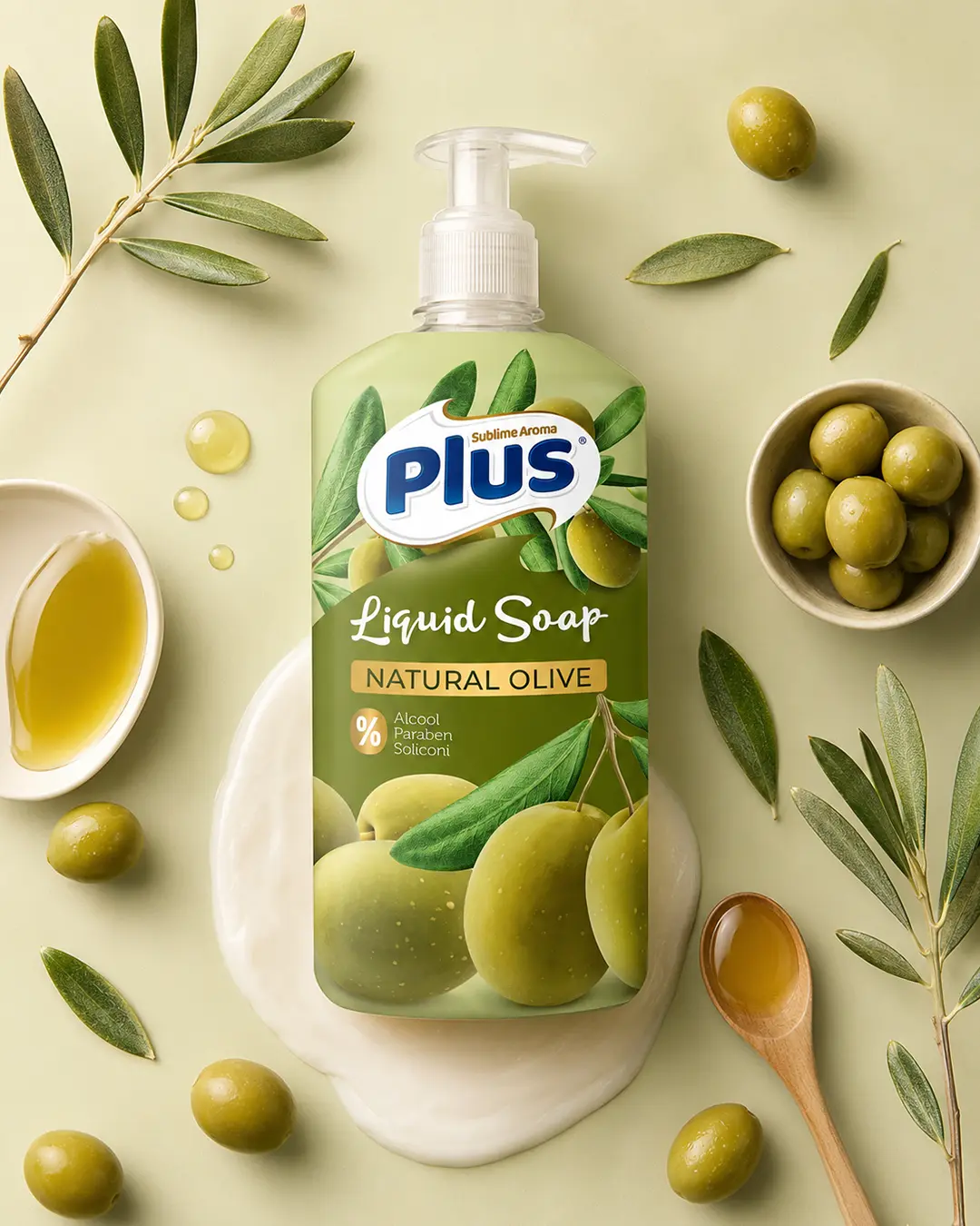
I developed a refreshed packaging system for Plus Liquid Soap across five fragrance variants while remaining faithful to the brand’s established identity. The design combines a modern, elegant and approachable structure with ingredient-led imagery and clear colour coding. Each variant is immediately distinguishable while the complete range remains cohesive and clearly part of the Plus family.
Differentiate five fragrances quickly on shelf without fragmenting the master brand or allowing ingredient imagery to overpower the product name and key information.
I retained the core Plus brand signature, created a repeatable label architecture and used ingredient-led colour and imagery as a controlled navigation system across the range.
The final system gives every fragrance its own clear personality while maintaining consistent logo scale, typography, information hierarchy and product-family recognition.