01 The challenge
Create clear differentiation across popcorn and shaped-snack variants without losing the recognition and consistency of the master brand.
Multi-Product Packaging System
A flexible snack-packaging family that unites different product formats and flavours under one bold, recognisable Chopix identity.
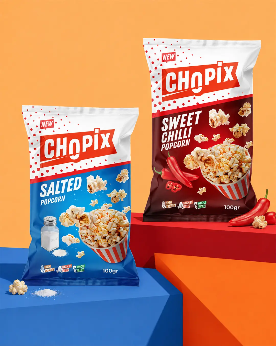
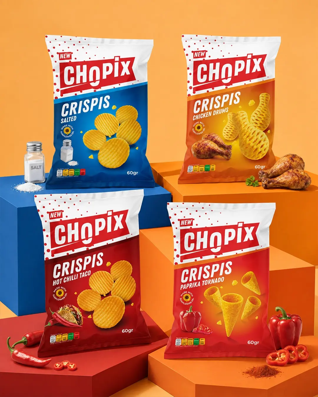
I developed a cohesive packaging system for Chopix across its Popcorn and Crispis snack ranges. A strong red-and-white master brand creates immediate recognition, while blue, red and orange flavour fields distinguish Salted, Sweet Chilli, Chicken Drums, Hot Chilli Taco and Paprika Tornado variants. Clear typography and product-led imagery keep every pack energetic, appetising and easy to navigate on shelf.
Create clear differentiation across popcorn and shaped-snack variants without losing the recognition and consistency of the master brand.
I established a fixed red-and-white brand block, then used flavour-specific colour fields, prominent product imagery and a consistent hierarchy across every pack.
The resulting system feels varied at flavour level yet unmistakably unified as Chopix, with strong shelf impact and fast product recognition.