01 The challenge
Create a memorable specialist brand that communicates surface renewal and works convincingly on industrial equipment, vehicles and signage.
Logo & Visual Identity Design
A sharp automotive identity built around transformation, precision and the visual idea of an eclipse.
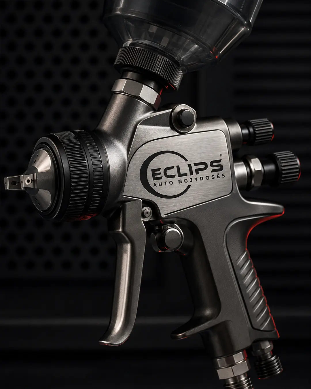
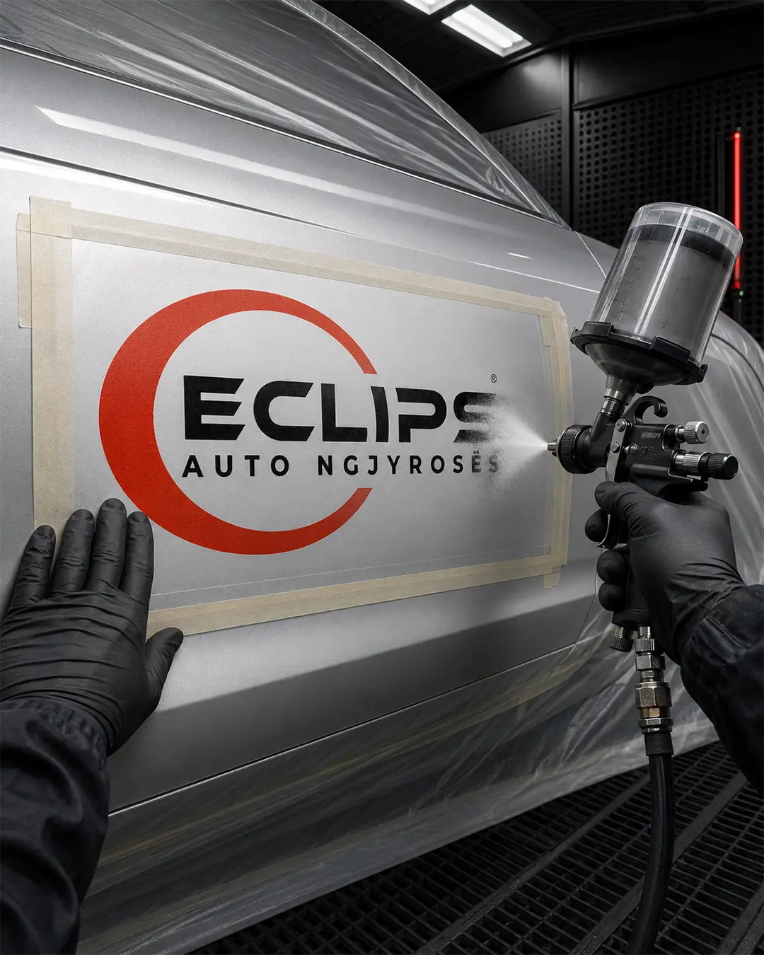
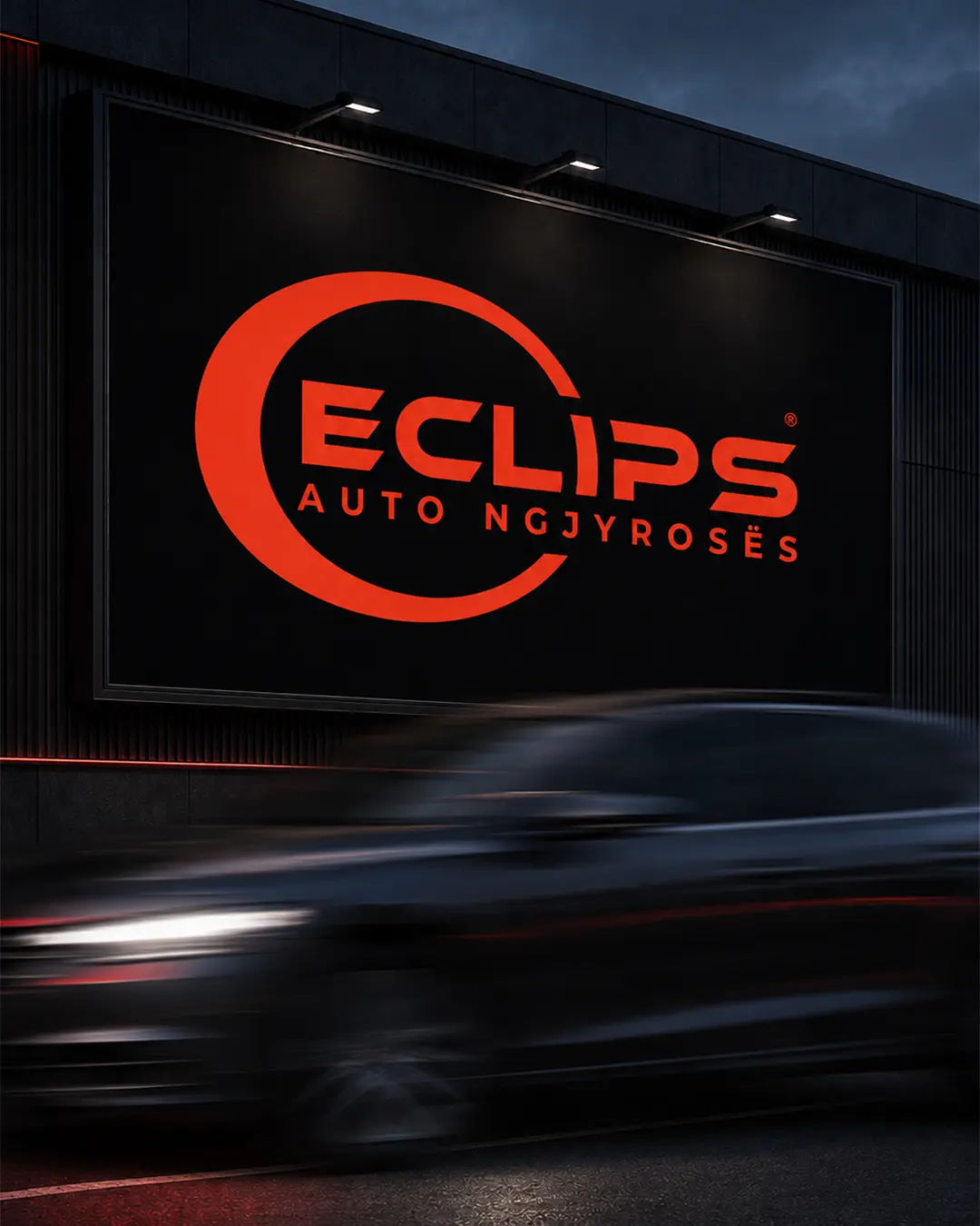
I designed the logo and visual identity for Eclips, an automotive refinishing specialist. The name is adapted from ‘eclipse’: the internationally recognised C was retained instead of the Albanian K, while the final E was removed to create a shorter, sharper and more distinctive brand name. The open circular form surrounding the wordmark represents an eclipse, transformation, motion and the renewal of a vehicle’s surface. The identity was designed for workshop equipment, paint booths, signage and branded applications.
Create a memorable specialist brand that communicates surface renewal and works convincingly on industrial equipment, vehicles and signage.
I developed a shortened name, a technical wordmark and an open circular device that expresses eclipse, motion and transformation.
The resulting identity is compact, distinctive and highly adaptable across both close-detail applications and large-format workshop branding.