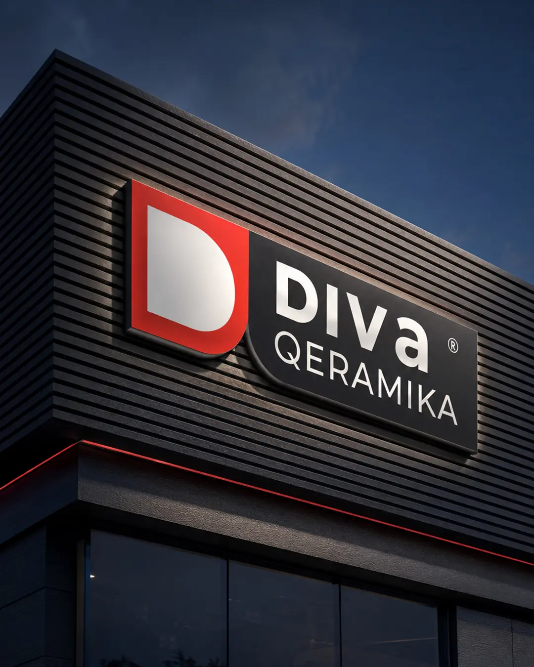
01 The challenge
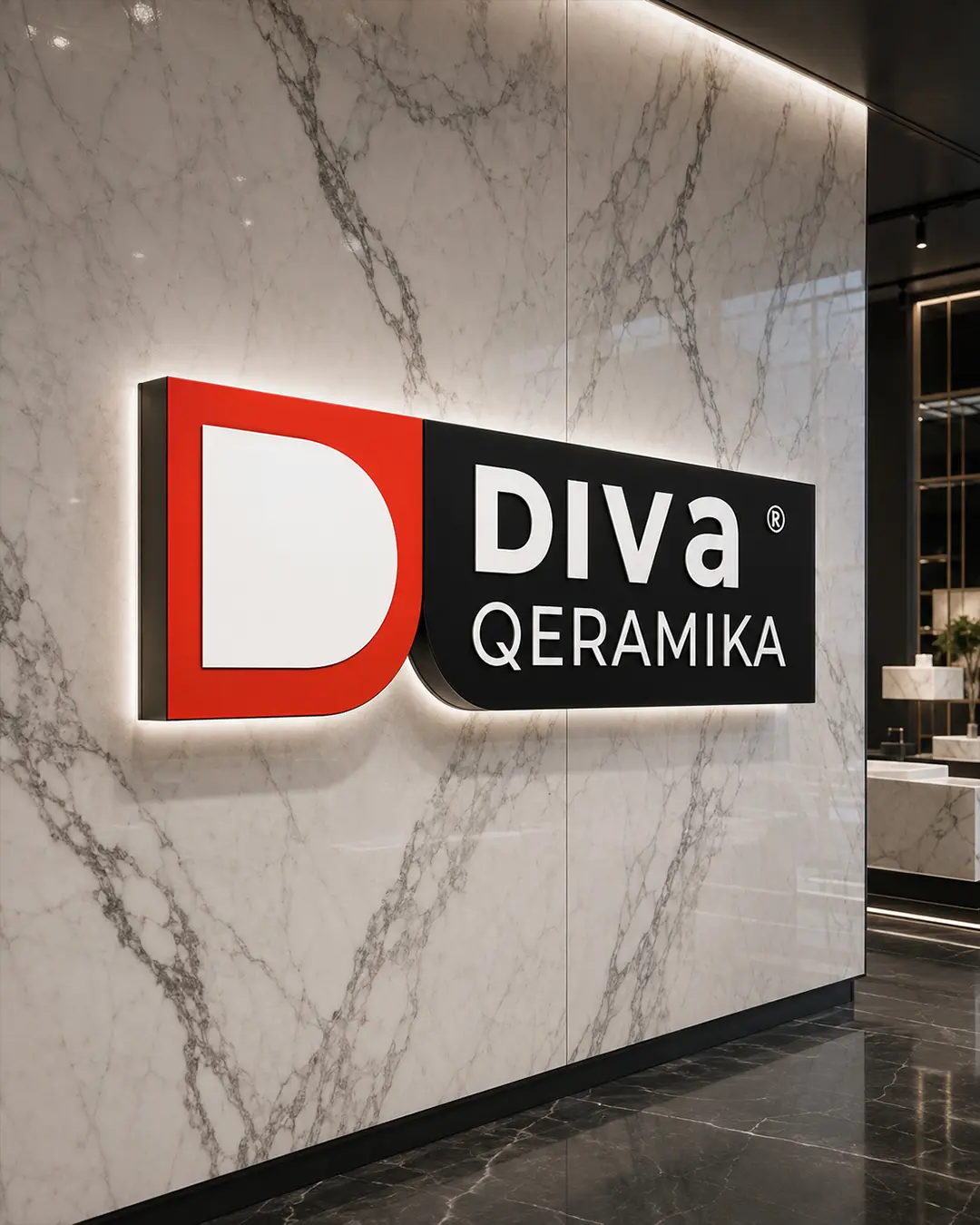
Create a simple initial-based mark with enough character to stand apart, while making it practical for illuminated signage, showroom interiors and material-led brand applications.
Logo & Visual Identity Design
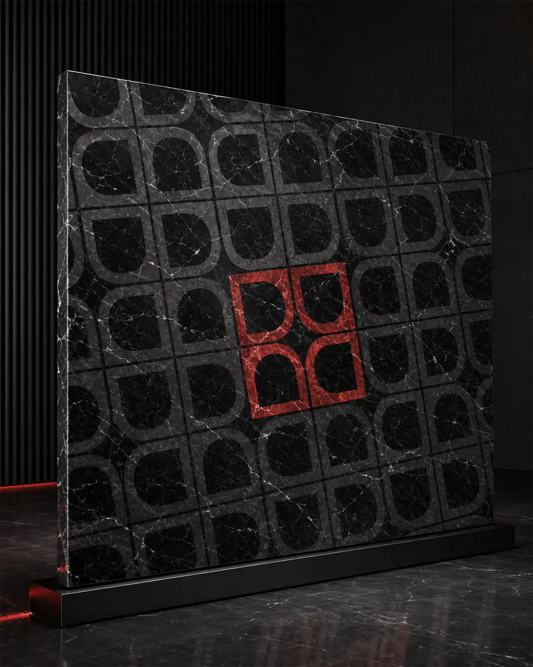
A premium identity for a ceramics and architectural-surfaces brand, built from a distinctive D symbol that can operate as a logo, a physical sign and a repeatable pattern.
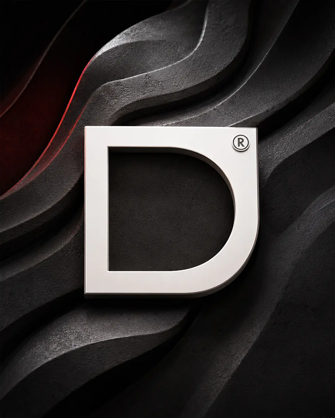
I designed the logo and visual identity for Diva Qeramika, building the company symbol from the initial D. The geometric mark combines a strong rectangular frame with a softened inner curve, reflecting the precision and material character of architectural surfaces.
Create a simple initial-based mark with enough character to stand apart, while making it practical for illuminated signage, showroom interiors and material-led brand applications.
I constructed the D from a precise outer frame and a softer inner curve, then repeated and rotated the form to create a flexible geometric surface pattern.
The final identity combines premium restraint with strong physical presence and gives Diva Qeramika one recognisable device across signage, showrooms and presentation surfaces.